What kind of product images have high click rate
When making product pictures, we need to know that we are selling things, not just click-through rates. We have to ask ourselves a few more questions: 1. When you buy items by yourself, what kind of pictures are more attractive to you 2. When buying something by yourself, what kind of picture will make you feel uncomfortable 3. When buying something by yourself, what kind of picture will make you order and pay.
Some points we need to pay attention to when making product pictures:
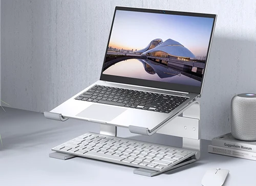
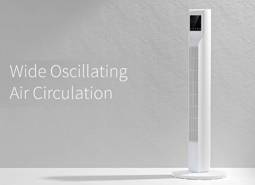
1. Simple and easy. Don't put too much complicated material on the picture, this will only disturb the consumer's vision, it is better to try "go to the complicated and simple" to make your main picture a new look.
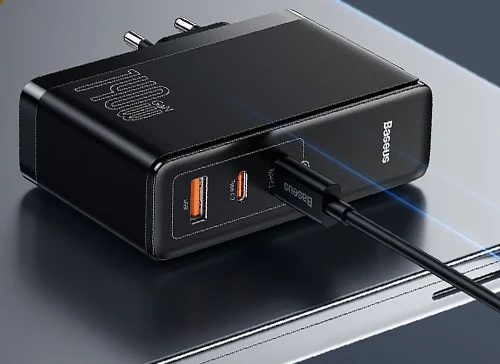
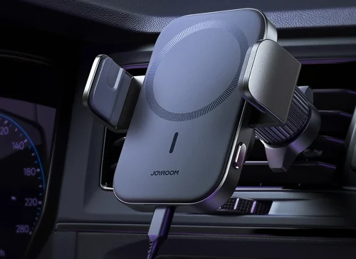
2, clear product pictures Clear product pictures not only allow consumers to clearly see the style and style of your product, but also increase the click-through rate, and also improve the quality of the product. Quality is one of the important roles in maintaining your brand.
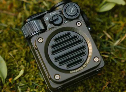
3. Product angle The angle is also one of the important factors related to the click rate. The angle is not set well, and the style and style are not clear. Would you click? Therefore, we must pay attention to when placing products, we must choose the perspective of the product in front of consumers.
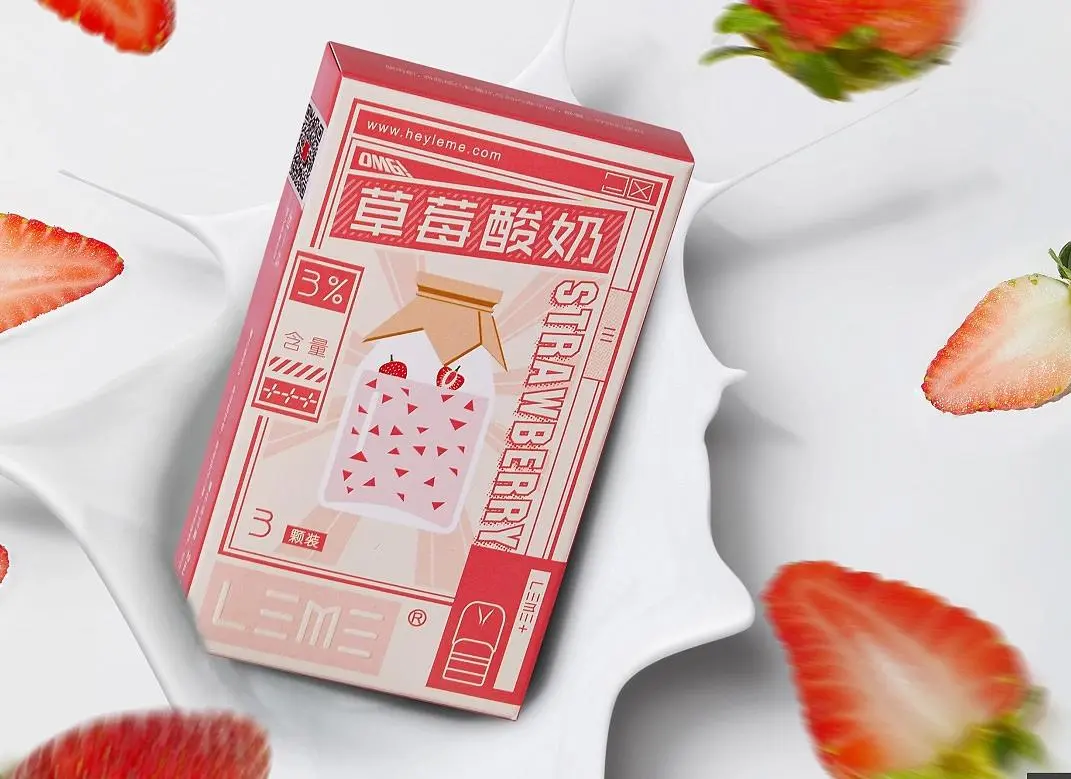
The background color and product color have a large contrast, which can quickly display the product in front of your eyes with strong visual impact.
Picture composition method:
1. Centerline composition: Place the theme element in the center of the layout
2. Diagonal composition: put the theme elements on the diagonal
3. Spread the picture: Enlarge the element and suppress the layout
4. Left picture and right picture: text on the left and picture on the right
5. Left picture and right word: picture on the left and text on the right
Except for the left picture, right picture, left picture, right picture composition methods are not applicable to some businesses, it is recommended that these businesses use the center line, diagonal lines, frame the picture composition, the most important point of this composition method is the quality of the picture.
Picture color matching method:
1. Adjacent colors: Because the adjacent colors are relatively close, they have a strong correlation. This combination has a weak visual impact, but can create a warm feeling.
2. Space color matching: This color gives people a pleasant, lively and vivid feeling, and the visual impact is stronger than the adjacent color
3. Complementary colors: Complementary colors have a strong visual impact, and they are also very fashionable when they are well controlled, otherwise they are uncoordinated and disturbing.
How to match your main picture with suitable colors?
The first thing to consider is your own consumer group:
Female consumer groups: Applicable to adjacent colors and spaced colors, and the color matching is mainly warm and pleasant;
Male consumer group: It is suitable for interval colors and complementary colors, mainly for atmospheric and stable color matching.
Red orange yellow green blue purple, the farther the hue is, the stronger the contrast, and the closer it is, the softer the match. The last is to control the color ratio of the picture.
Before typography, we must do the preparatory work (understand the product, positioning style, set the copy, take a good photo) post-work (typesetting design)
Composition: Some categories cannot be used with text composition, then you can use other composition methods.
Color matching: Female consumers choose warmer, softer colors, and men choose stable, darker colors.
Pictures are the first impressions of consumers on products. Do n’t pursue creative expressions, try to simplify, choose clear product pictures, set the angle of the product, distinguish the background color from the product color, maybe the traffic will Less, but the click is definitely accurate traffic, which is a few things we need to do in typography.


